Exhibition
Curatorial Rationale
When it comes to the fine arts themselves, the vision for my work was for it to be bold. I wanted each piece to have its own presence. I never really intended my pieces to connect because the creative process wasn’t supposed to be limited by given themes. Overall, my body of work is to be shown as an evolution of me as the artist, the student and person. All of these which can be found within the pieces of art themselves.
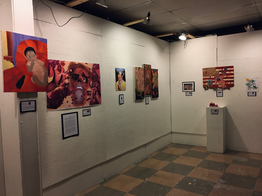
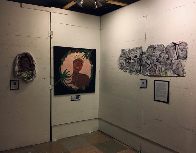
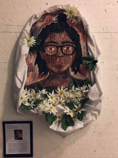
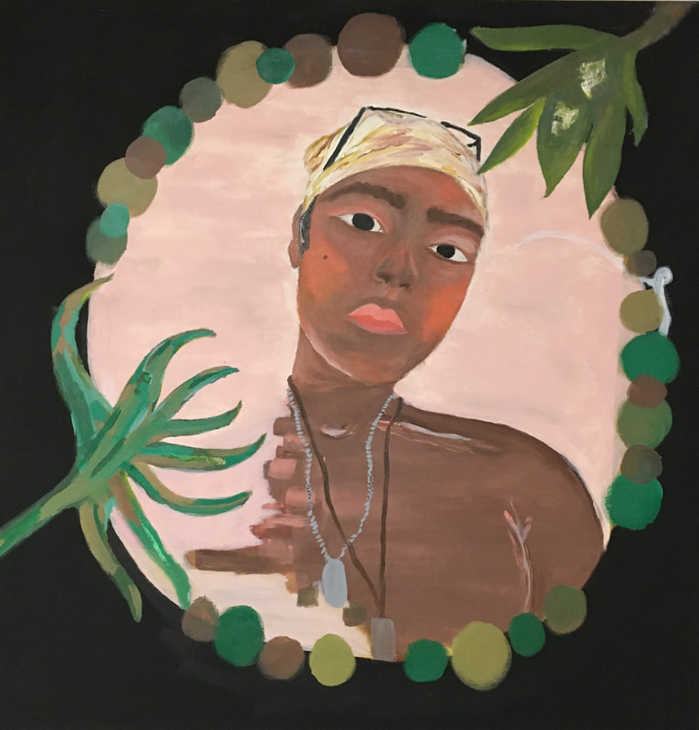
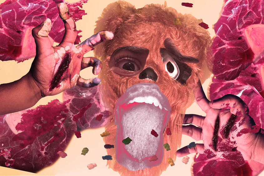
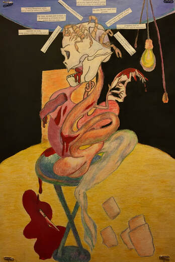
The particular motifs and materials used in my work revolve around traditional illustration and paintings. My two dimensional works were very heavy in my process portfolio and my overall body of work. I based most of the meaning and metaphor of my artistic choices on Francis Bacon’s signature style and iconography. I decided to follow Bacon’s style as an inspiration because I found his art to be reminiscent of my own creative style. I thought that the themes of my body of work would be able to be emphasized by the same techniques that Bacon employs in his paintings of bloody crucifixion and deformed bodies. With that said, the themes that I found myself creating during the last two year can be divided into three different categories: political, self-portraits and more Francis Bacon based work. The themes were born from an “over dramatization of my life experiences as a latina raised in the south side of Milwaukee. Violence and politics were consistent in my work as they are what I hear and see the most of in the city. My exhibit became a stage for my personal views and experiences of the city I came to know as my one and only home.
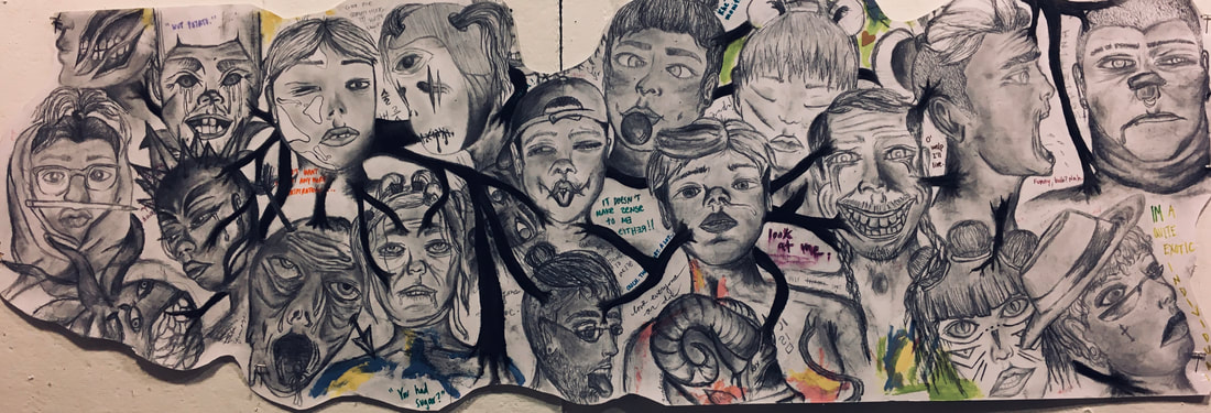
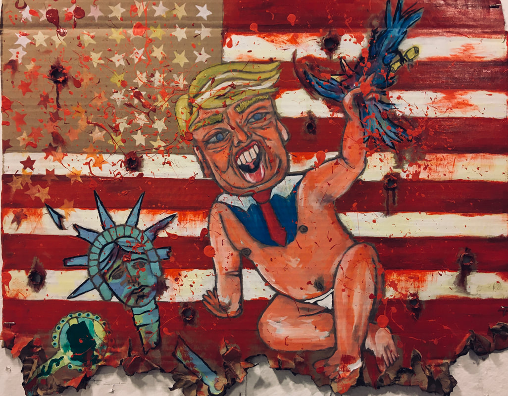
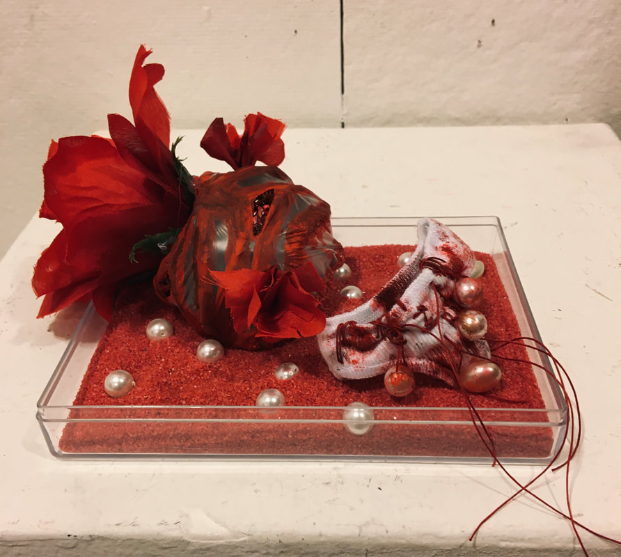
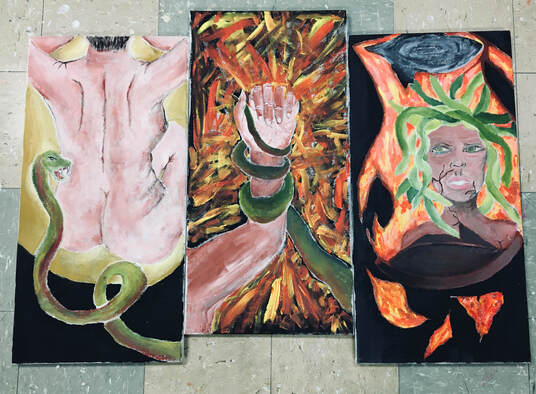
The themes mentioned before were what had set up my exhibit. Each piece would of course fall into a given category and so all that was left to do was create a balanced aesthetic for my final exhibition. In order to do so, I had to make sure that the viewer and the artwork had a relationship. I did this through a visual impact of political pieces with a strong usage of color. For example in piece “Politicians Are Not Your Friends”, I make use of the American Flag as a symbol of chaos rather than a unification of a country. How? The color red. The stripes on the flag were already a strong hue of red so I used it to my advantage and pigmented the paint into a more blood red than the original red. I then proceeded to splatter the color across the cardboard. I made sure to have color not only be saturated in a certain manner but also placed down onto the board with a certain effect. The splattered paint was violent and added to my desired effect for a “bloody” composition. Other ways in which I achieve a better visual impact to the viewer was by overwhelming the canvas with positive space, almost suffocating the piece with itself. Which can be seen in “Youngblood?”, the second panel of “Dieu ou est tu?” and “Politicians Are Not Your Friends”. Once all of these were put together in my exhibit by the separation of themes, the impact on the viewer is highlighted by the personal connotation to each theme. My pieces are set up in my exhibit in a way in which there’s balance between them all. With this I mean the size of the artwork would also play a part on their positions on my exhibit. They all compliment each other based on the space available to each, which is how each piece gets to show its own presence. The visual impact is stronger this way as I want the audience to experience the pieces as singular bodies of work yet having latent connections as a holistic exhibition. The main feeling that is aimed to be projected onto the viewers is one of slight discomfort (from pieces like Youngblood and Politicians Are Not Your Friends) as well as a violent sentiment that are based on happenings at a global stage (as portrayed by my pieces Rojo, Scripture and Dieu ou est tu?).
When it comes to the fine arts themselves, the vision for my work was for it to be bold. I wanted each piece to have its own presence. I never really intended my pieces to connect because the creative process wasn’t supposed to be limited by given themes. Overall, my body of work is to be shown as an evolution of me as the artist, the student and person. All of these which can be found within the pieces of art themselves.
The particular motifs and materials used in my work revolve around traditional illustration and paintings. My two dimensional works were very heavy in my process portfolio and my overall body of work. I based most of the meaning and metaphor of my artistic choices on Francis Bacon’s signature style and iconography. I decided to follow Bacon’s style as an inspiration because I found his art to be reminiscent of my own creative style. I thought that the themes of my body of work would be able to be emphasized by the same techniques that Bacon employs in his paintings of bloody crucifixion and deformed bodies. With that said, the themes that I found myself creating during the last two year can be divided into three different categories: political, self-portraits and more Francis Bacon based work. The themes were born from an “over dramatization of my life experiences as a latina raised in the south side of Milwaukee. Violence and politics were consistent in my work as they are what I hear and see the most of in the city. My exhibit became a stage for my personal views and experiences of the city I came to know as my one and only home.
The themes mentioned before were what had set up my exhibit. Each piece would of course fall into a given category and so all that was left to do was create a balanced aesthetic for my final exhibition. In order to do so, I had to make sure that the viewer and the artwork had a relationship. I did this through a visual impact of political pieces with a strong usage of color. For example in piece “Politicians Are Not Your Friends”, I make use of the American Flag as a symbol of chaos rather than a unification of a country. How? The color red. The stripes on the flag were already a strong hue of red so I used it to my advantage and pigmented the paint into a more blood red than the original red. I then proceeded to splatter the color across the cardboard. I made sure to have color not only be saturated in a certain manner but also placed down onto the board with a certain effect. The splattered paint was violent and added to my desired effect for a “bloody” composition. Other ways in which I achieve a better visual impact to the viewer was by overwhelming the canvas with positive space, almost suffocating the piece with itself. Which can be seen in “Youngblood?”, the second panel of “Dieu ou est tu?” and “Politicians Are Not Your Friends”. Once all of these were put together in my exhibit by the separation of themes, the impact on the viewer is highlighted by the personal connotation to each theme. My pieces are set up in my exhibit in a way in which there’s balance between them all. With this I mean the size of the artwork would also play a part on their positions on my exhibit. They all compliment each other based on the space available to each, which is how each piece gets to show its own presence. The visual impact is stronger this way as I want the audience to experience the pieces as singular bodies of work yet having latent connections as a holistic exhibition. The main feeling that is aimed to be projected onto the viewers is one of slight discomfort (from pieces like Youngblood and Politicians Are Not Your Friends) as well as a violent sentiment that are based on happenings at a global stage (as portrayed by my pieces Rojo, Scripture and Dieu ou est tu?).
|
|
|
|
|
|
Comparative Study
|
|
| |||||||
Process Portfolio
| pp_source_page.pdf |
