
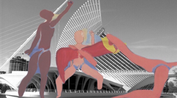
Nuestra Epifanía...Size : 30 in x 36 in
Medium : Mixed Media (Digital Manipulation & Silk Screening) Date : October 2018 |
"Nuestra Epifanía..." is a piece composed of two different designs which were created through different medias: acrylics, color pencils, and Photoshop CS6. The final products were finalized at MIAD's silk screening studios. The piece was inspired by the compositions in Matisse's "Dancers" as well as the techniques of both of the "Untitled" artworks created by Owens and Dzama. This piece conveys the essence of a strong and diverse community by showcasing a story of their manifestation.
|
AN IN DEPTH EXPLANATION OF THE PIECE:
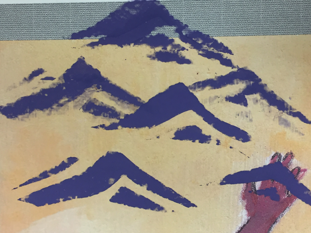
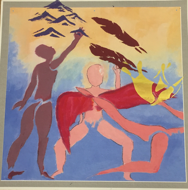
The top piece is the Epifanía (epiphany) of the three bottom pieces. While all three of the pieces represent a different part of Milwaukee's history, I have broken it down to the three main characteristics that I believe make Milwaukee an attractive city to those that live here and to those that don't.
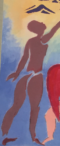
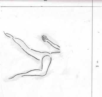
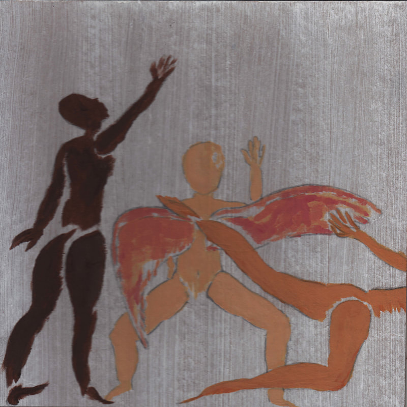
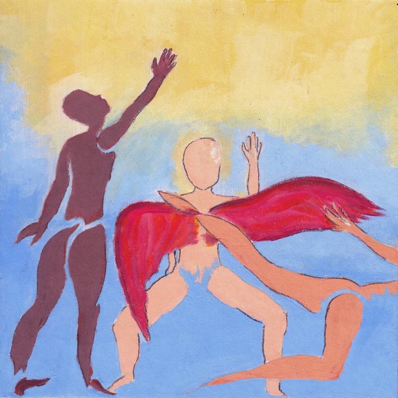
First of all is the dark skinned figure to the far left of the piece. The back is facing the audience as to not give away whether the figure is a female or a male. That's the same case for the other two character found within the same piece.
The top piece is the Epifanía (epiphany) of the three bottom pieces. While all three of the pieces represent a different part of Milwaukee's history, I have broken it down to the three main characteristics that I believe make Milwaukee an attractive city to those that live here and to those that don't.
First of all is the dark skinned figure to the far left of the piece. The back is facing the audience as to not give away whether the figure is a female or a male. That's the same case for the other two character found within the same piece.
|
|
The figure represents the dark waters running under the historic third ward in Milwaukee as well as the racial make ups of Milwaukee with melanin rich skin tones.
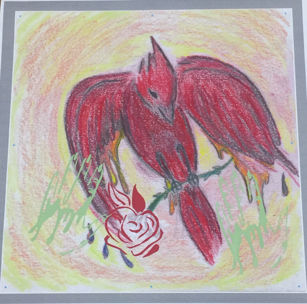
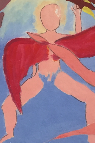
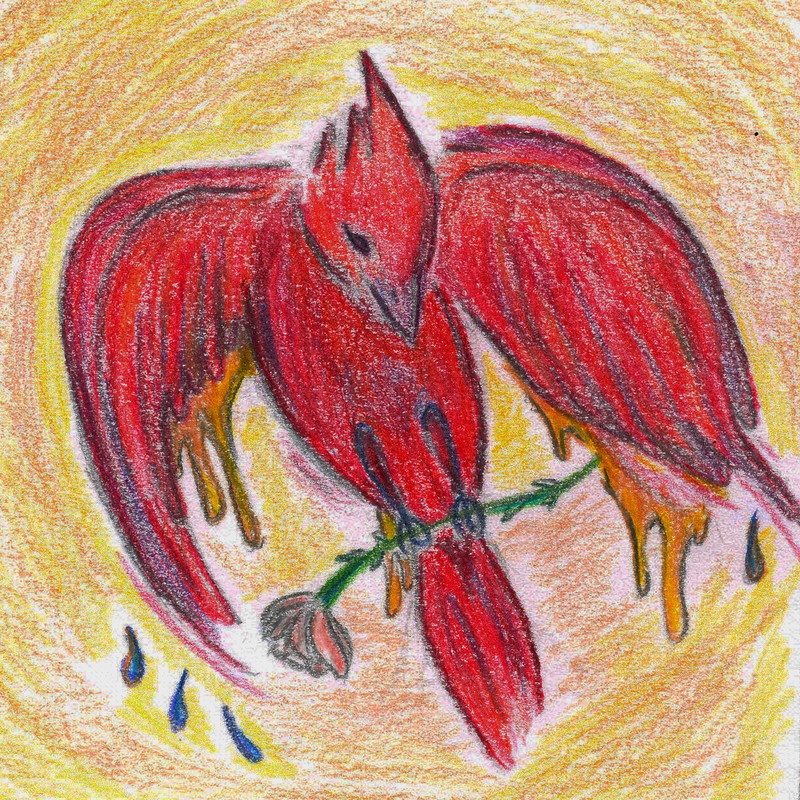
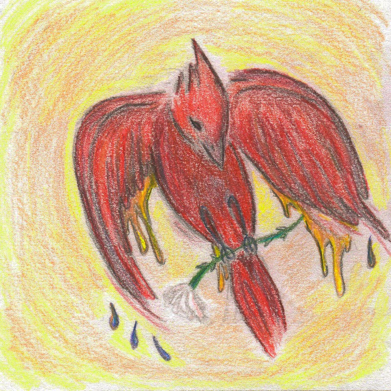
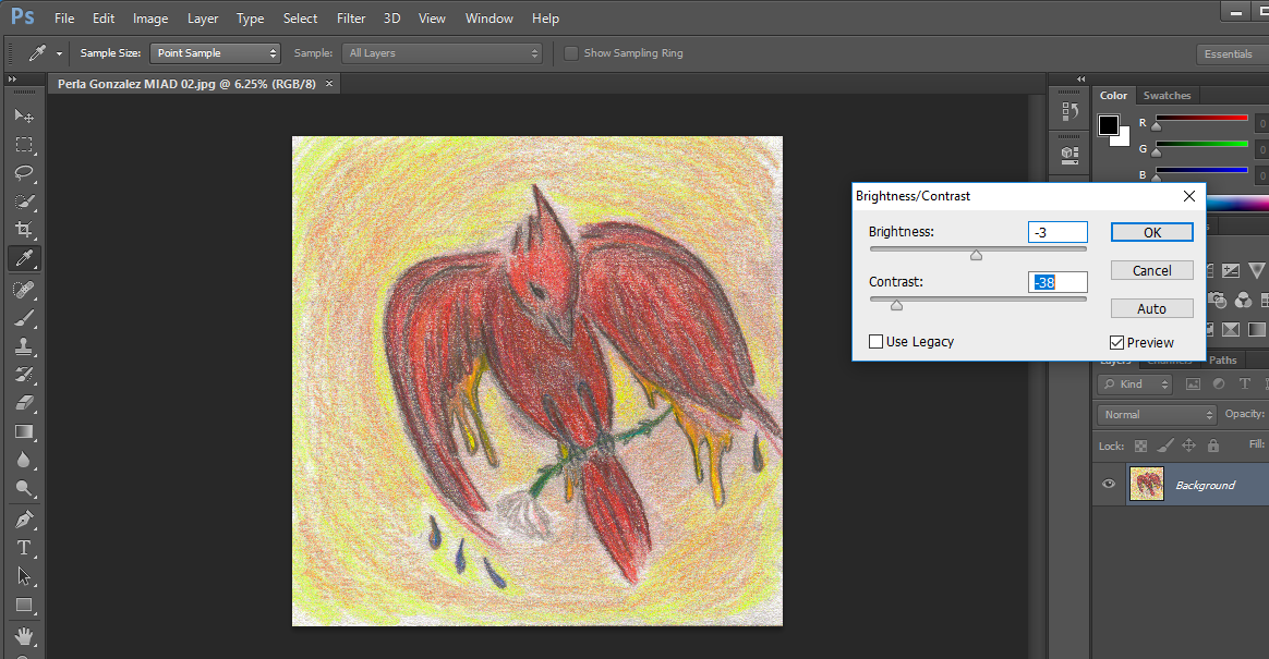
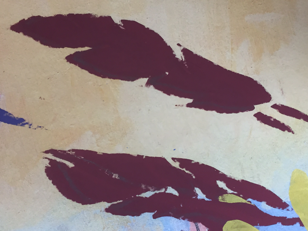
The following figure with the wings spread across their chest represents the population of the state with a lighter complexion and the rather striking image of the bright red robin wings. The red robin is a rare type of bird that can be seen in Milwaukee, mostly during the winter.
The following figure with the wings spread across their chest represents the population of the state with a lighter complexion and the rather striking image of the bright red robin wings. The red robin is a rare type of bird that can be seen in Milwaukee, mostly during the winter.
|
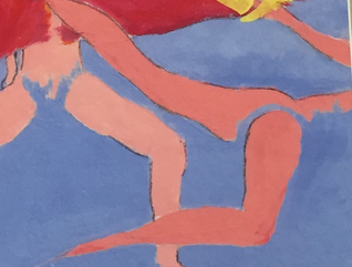
For the final figure I wanted to create a skin tone that was between light and dark. If I accomplished that or not may be judged by the viewer as there are more tones of complexions that dark to light. I aiming for the idea of diversification on the city and I assumed that was one way to approach the situation.
Furthermore, I attempted to imitate the construction of the Mke Art Museum with the specific formation of the figures, each positioned in an certain pose as to recreate the museum in a more simplified and not so obvious set up with in my canvas. |
|
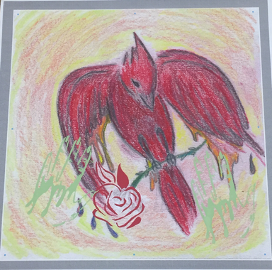
As for the second part of the piece, the drawing of the red robin ties to a personal belief from home. From a young age, before I knew the name of the bright ruby hued avifauna, my mom believed that you were given the chance to spot the bird at any given time of the year,then it was a sign of good luck. Because of the bird's intense color it was believed by my family that it would attract the attention of good energies, thus I decided to include it in "Nuestra Epifanía...".
"Milwaukee Art Museum, Wisconsin" by Santiago Calatrava. Retrieved from, https://www.fsbna.com/us/inspirations/projects/milwaukee-art-museum-wisconsin/
ARTISTIC
I N S P I R A T I O N
(A Critical Investigation)
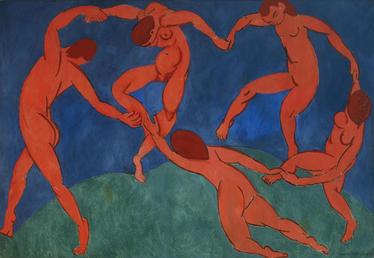
"Dance" by Henri Matisse (1869-1954). Retrieved from,
https://www.hermitagemuseum.org/wps/portal/hermitage/digital-collection/01.+Paintings/28411/?lng= |
|
There were multiple artists that inspired my pieces for the MIAD Project.
It began with the Classical Matisse Piece, "Dance" and a fusion of more contemporary artists, Laura Owens and Marcel Dzama.
The components in the Matisse painting that caught my attention was the movement of the figures. There's a flow in the lines and shapes in his piece that would really fit with my own shaped style of similar "dancers".
As for the Laura Owens piece, I choose to follow a similar style of brush work and combine it with the Matisse movement to exaggerate the brush lines of the paint in my final piece.
Finally, the inspiration that Marcel's Dzama "Untitled" has brought me was the reoccurring theme of fantasy and unusual beings in his artwork.
I want incorporate such theme into my process of creation to be able to tell a story. Specifically, the story of my home city, Milwaukee, as a rising community with a rich history of it's foundation and key aspects that make it....well, Milwaukee.
The way I plan to do that is by setting the figures up as mystical creatures that deliver a part of themselves to a common work of unity.
P R O C E S S
&
I N T E N T I O N S
01. Creative Ideas & Brainstorms
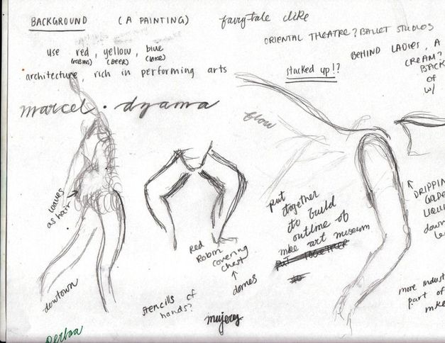
I had an idea to bring them all together, unified to create a part of Milwaukee in which the community can connect to either by memories or recognition of the place. It was not going to be easy...
Also deciding which type of media I would be using in order to bring this piece to life. |
POINTS OF INTERESTS INCLUDED IN NOTES:
|
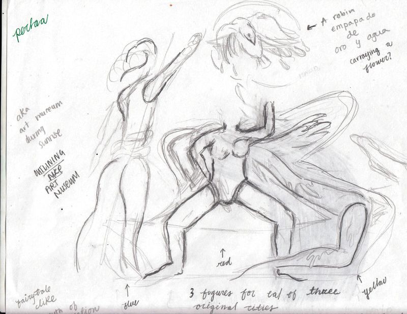
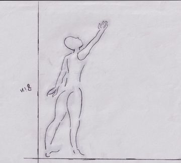
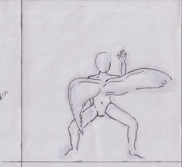
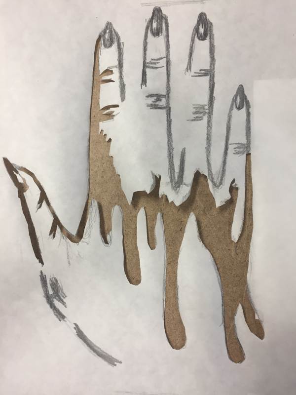
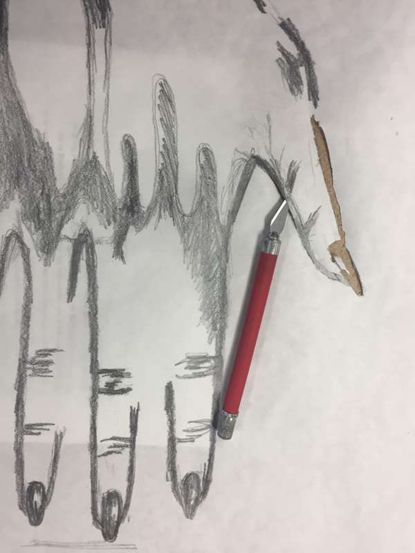
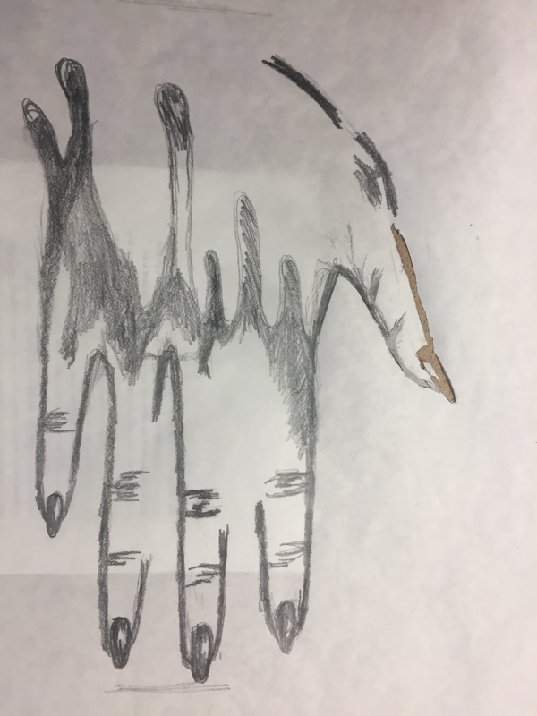
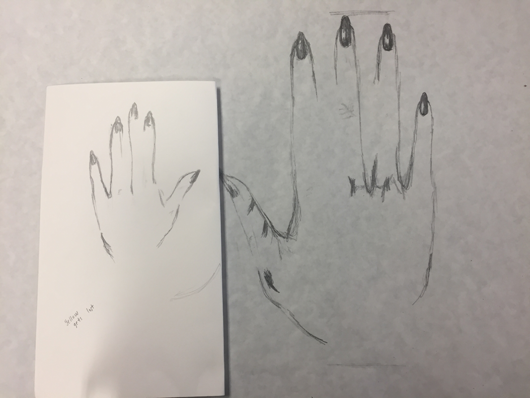
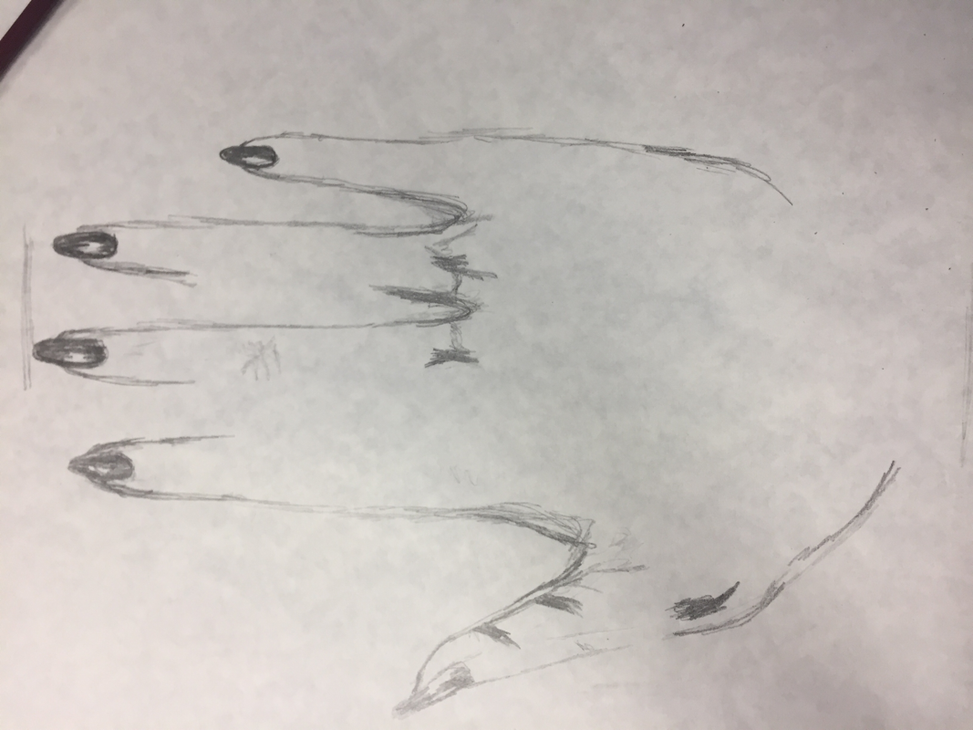
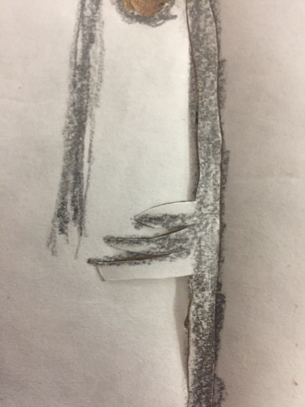
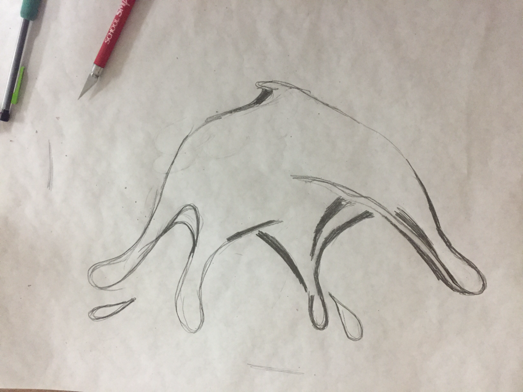
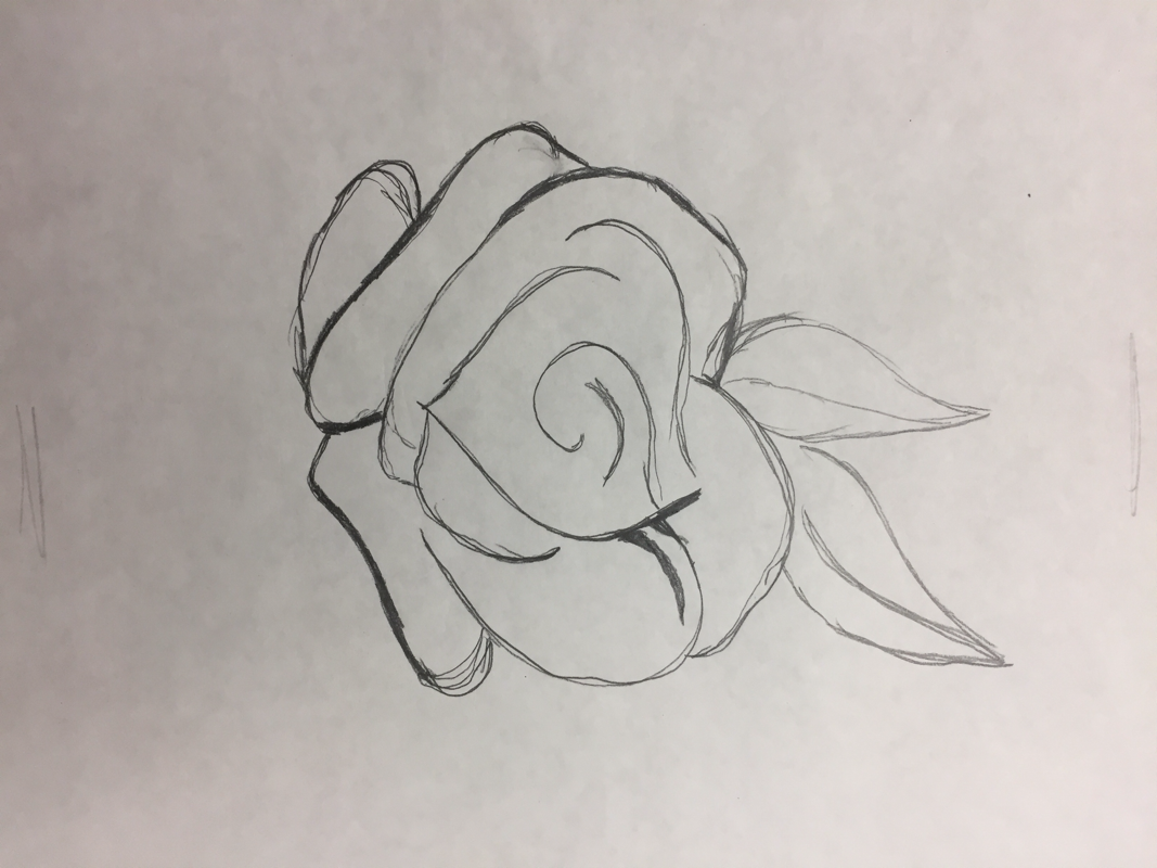
02. Into Planning
planning sketches
|
By this time I figured that I would leave the figures to be of an unknown sex.
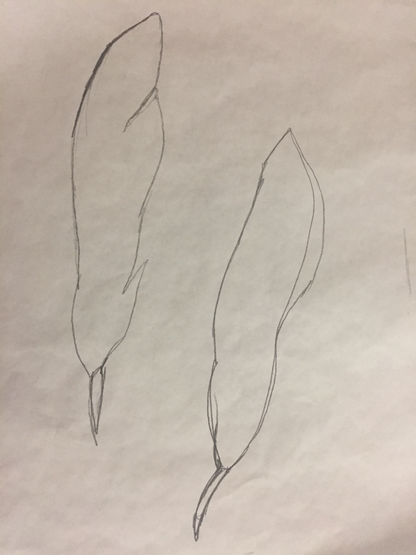
Ideas are flowing at a smother pace by now and I continue with a more detailed sketch of the plan. Bird at top of page was not set at the moment. Hadn't thought about second background just yet. However it later developed from that exact idea. |
|
|
|
03. Making Background #1
the painting
|
i. gesso on the canvas In order to create the first piece of "Nuestra Epifania..." I had to first prepare a piece of board (which was to become my working canvas) by priming it using White Gesso. I would paint one layer at a time with the use of a paint brush of a width of one inch and half. As the layers dried, I would decide whether or not I wanted to add more layers to the board. By the end of the gessoing process I had put 3 layers of primer on the board. |
|
- - - - - - - - - - - - - - - - - - - - - - - - - - - - - - - - - - - - - - - - - - - - - - - - - - - - - - - - - - - - - - - - - - - - - - - - - - - - - - - - - - - - - - - - - - - - - - - - - - - - - - - - - - - - - - - - - - - - - - - - - - - - - - - -
|
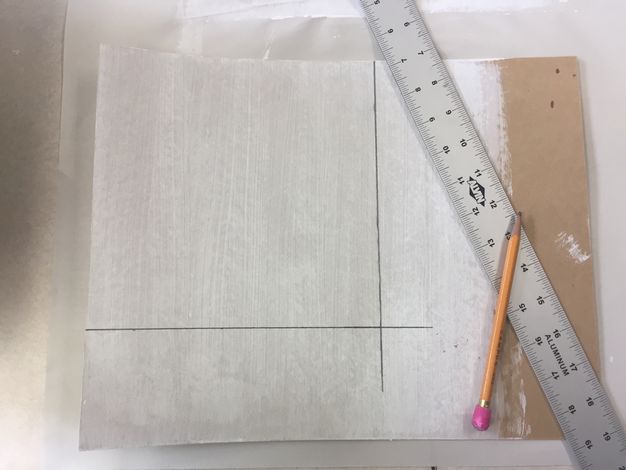
ii. determining proportions After the gesso was dry, I proceeded to measure and cut the board into a perfect square of 8 inches by 8 inches as it would later facilitate the scanning process. |
- - - - - - - - - - - - - - - - - - - - - - - - - - - - - - - - - - - - - - - - - - - - - - - - - - - - - - - - - - - - - - - - - - - - - - - - - - - - - - - - - - - - - - - - - - - - - - - - - - - - - - - - - - - - - - - - - - - - - - - - - - - - - - - -
|
iii. image transferring The next step in the process was to transfer a clean and solid outline of the figures onto the canvas. To achieve such task in the most efficient and quickest way, I made three separate outlines. One per figure. Then I added a non-toxic mineral known as graphite to the back of each of the papers with the outlines. Later on, I aligned one of the pages to the canvas and started tracing over the outline. The side with graphite would be the one on top of the primed board while I added pressure to the other side of the sheet. I repeated this procedure two more times and efficiently transferred the final images onto the surface of the canvas. |
|
- - - - - - - - - - - - - - - - - - - - - - - - - - - - - - - - - - - - - - - - - - - - - - - - - - - - - - - - - - - - - - - - - - - - - - - - - - - - - - - - - - - - - - - - - - - - - - - - - - - - - - - - - - - - - - - - - - - - - - - - - - - - - - - -
|
|
iv. adding acrylics At this point of the process, I began to lay down color onto the canvas. Each figure was to be a different skin tone. I was aiming to illustrate some of the many diverse people found in the Milwaukee. As for the wings I made a wash for the initial set up of the direction that I was to continue later on, after I had met with MIAD professor Jason Yi. However as I was completing the painting...something felt off. I was missing the wings in the center figure but besides that point I was once again unsatisfied with my work. |
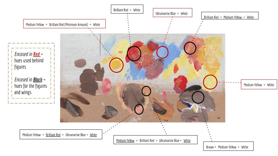
Labeled Scan Of Actual Palette Used To Compose Background #1
Unfortunately, I forgot to register the specific swatches of paint used for the first background, thus I scanned the palette with which I was working with and labeled as many of the different hues that I employed and experimented with as I was working through the process.
I restricted myself from using preexisting colors and opted for using primary colors acrylics and two other colors.
The acrylic paint tubes that I used were labeled the following : Brilliant Red / Medium Yellow / Ultramarine Blue / White / Brown
I restricted myself from using preexisting colors and opted for using primary colors acrylics and two other colors.
The acrylic paint tubes that I used were labeled the following : Brilliant Red / Medium Yellow / Ultramarine Blue / White / Brown
04. Meeting With Jason S. Yi
|
After having completed the first half of the backgrounds, I met with Artist and MIAD Professor, Jason S. Yi to get feedback on my work. Key points that he touched based upon included: Use of Color Emphasis Within the Composition Brightness of Hues |
|
Before Meeting With Jason Yi.
|
As for the second piece, Jason suggested the following: Create a Contrast of the Background with the Figures Tones of the wings and the body should be bolder Have overall image be brighter and lighter |
After Meeting With Jason Yi.
|
04. Revising & Editing Work
the digitizing
|
transforming into digital image(s) Once I had scanned the painting, I opened the piece in the Photoshop program and began to adjust the size and colors on the digital copy. 1. Open a new file 2. As I created a new file I immediately adjusted the dimensions of the piece to 3 ft by 3 ft, which translated to 36 by 36 inches. 3. Adjusted the resolution to 200 exactly |
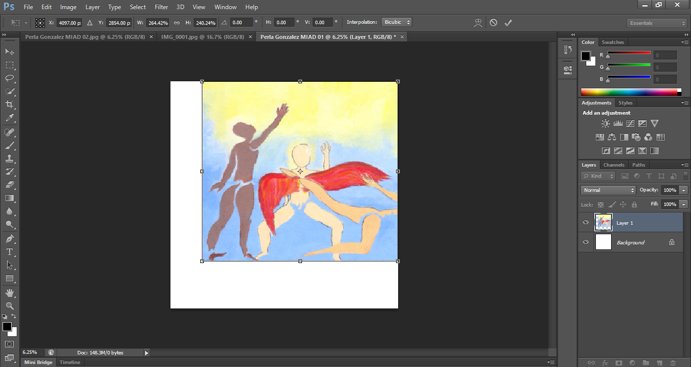
Using the Photoshop tools, Rectangular Marquee, Select Cursor and Transformations, I adjusted the painting so it will fit the screen as a perfect square and to facilitate the printing of the images later on.
|
|
( experimentation w/ photoshop cs6 )
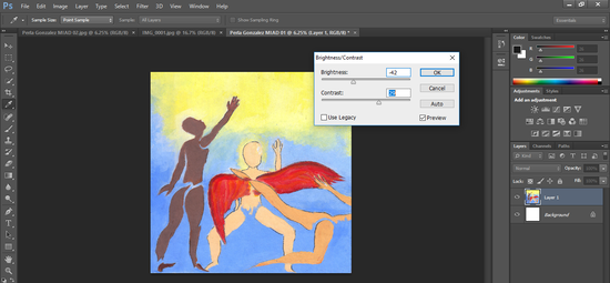
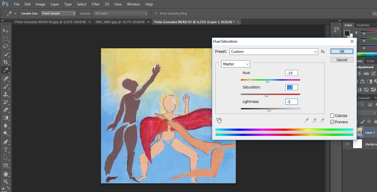
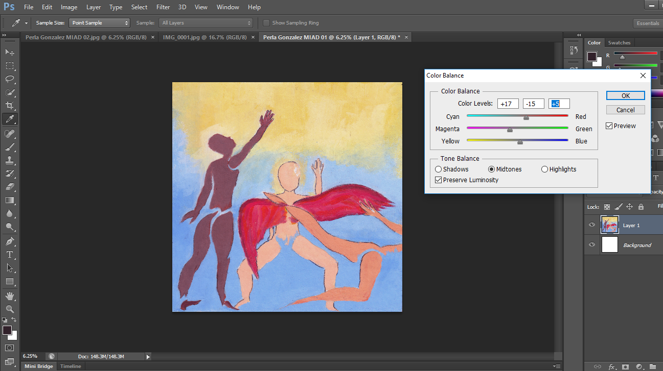
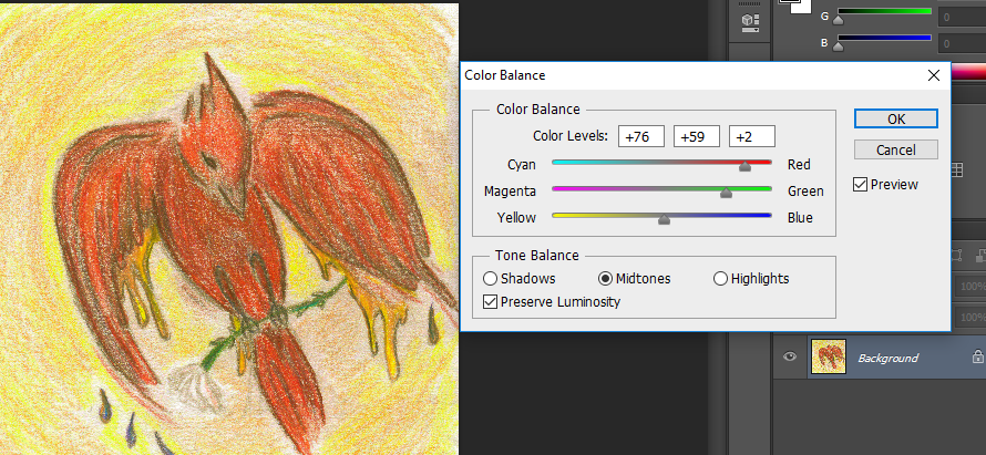
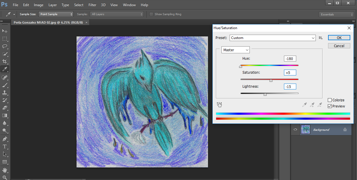
After the formatting on the digital version of the piece I began to experiment with the tools of photoshop by changing the levels of brightness, contrast, saturation/hues and color balance for both pieces.
|
|
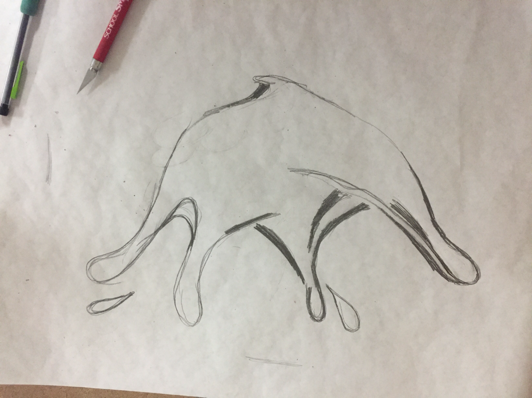
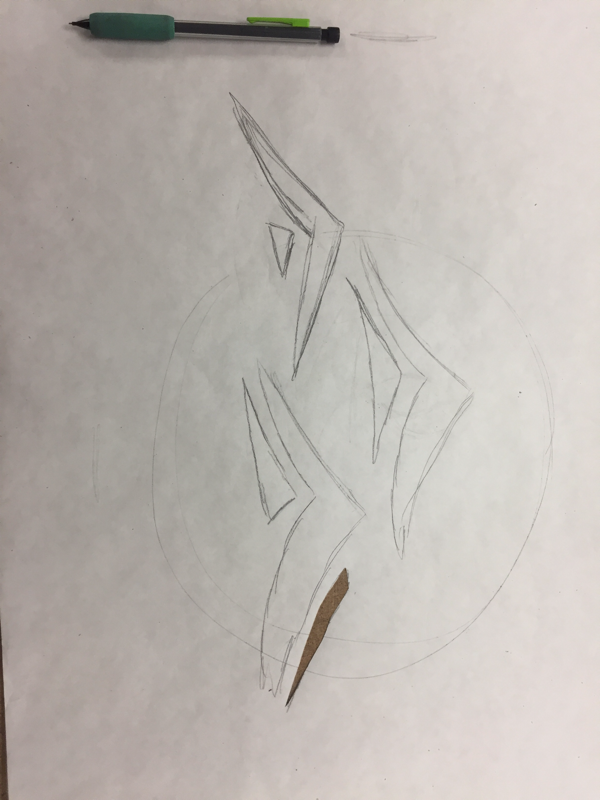
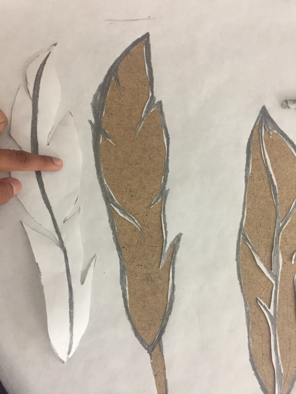
05. The Stencils
|
|
For the making of the stencils I followed the same formula for all five, which were:
"The Formula"
|
06. Silk Screening
|
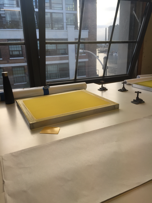
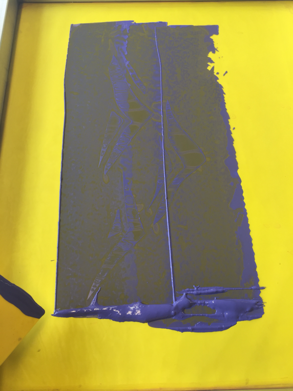
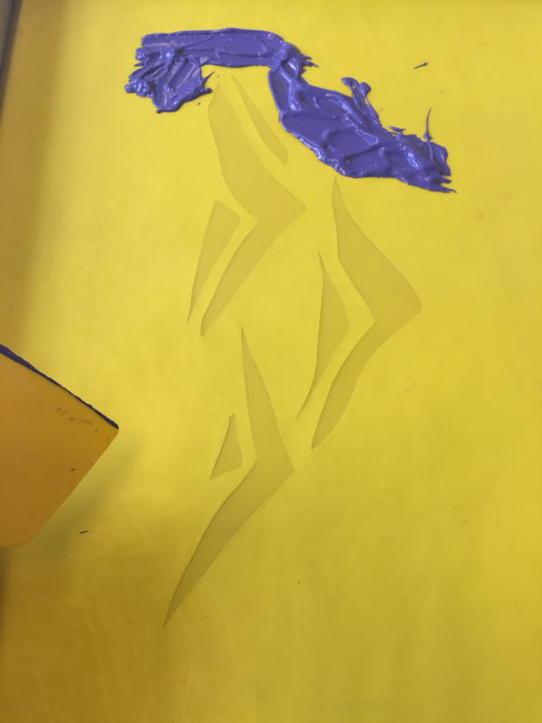
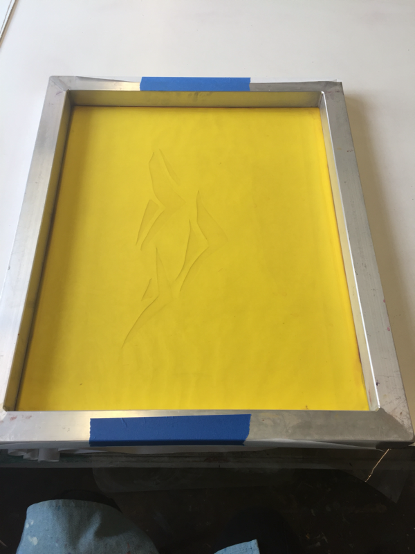
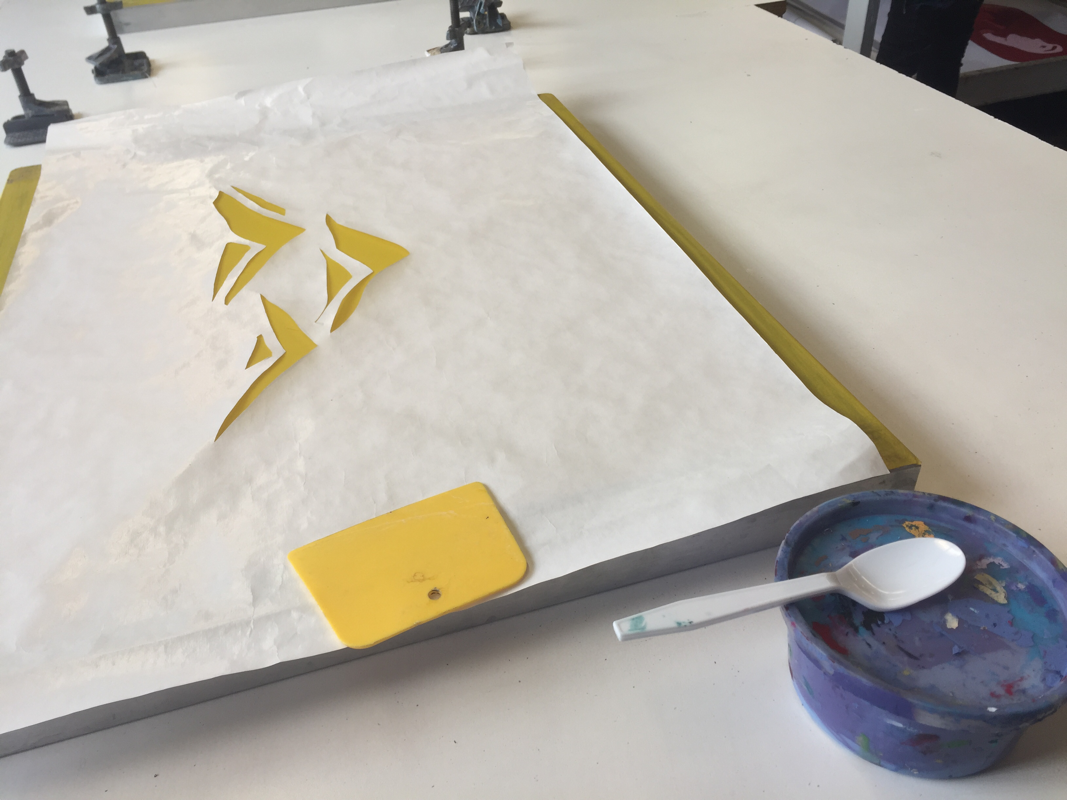
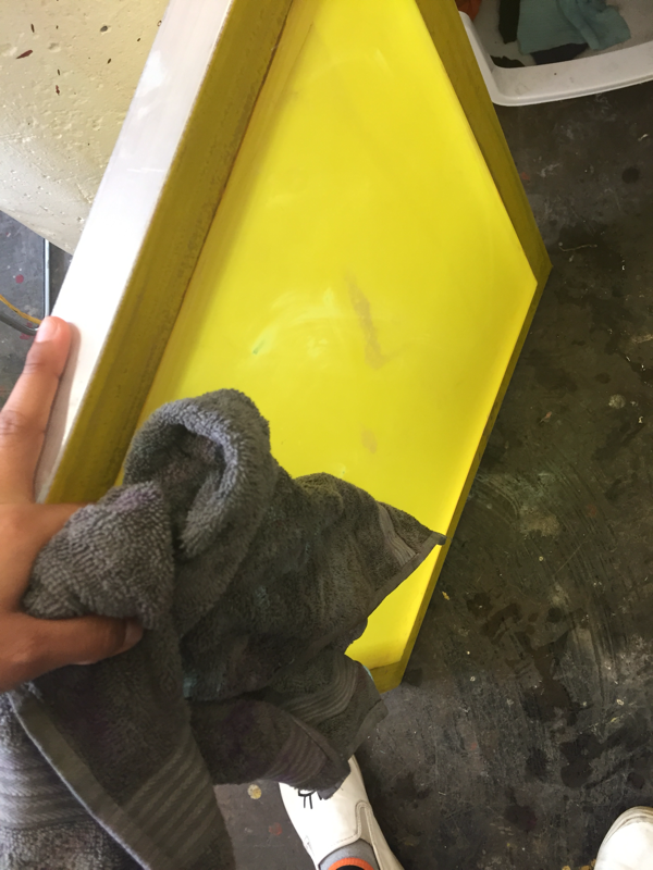
All of the silk screening process was to be done at one of MIADs studios in which we were given the opportunity to work with the staff there. The general set up of the silk screening process included a pieces of scratch paper to the side of the a yellow tinted screen, a little scrape tool and the colored screen printing inks of your preference. |
|
|
To silk screen an image I first laid the pre-cut stencil on the flat side of the screen. Second, I had to tape down the edges of the paper to the metal frame of the screen. After that I was to place a significant amount of Ink on the screen above the stencil to later scrape the ink down with a small scarping tool. This would transfer a clean and sharp stenciled image to the paper under the screen. |
|
|
|
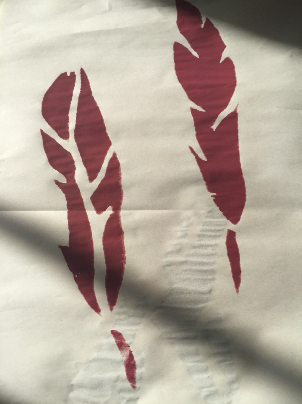
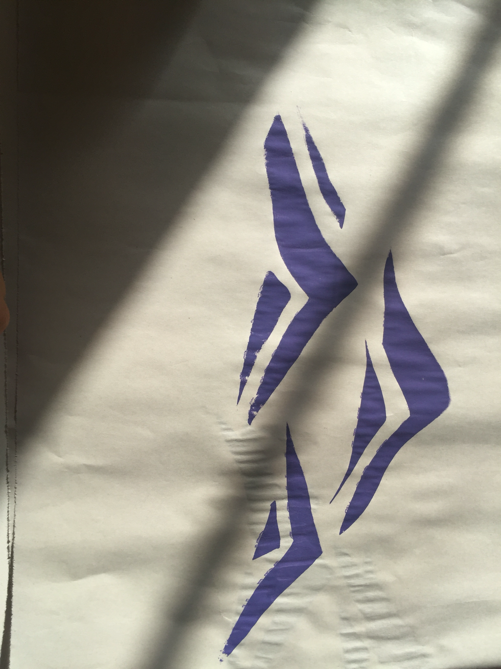
Above are examples of what the final images would look like after worked through the silk screen.
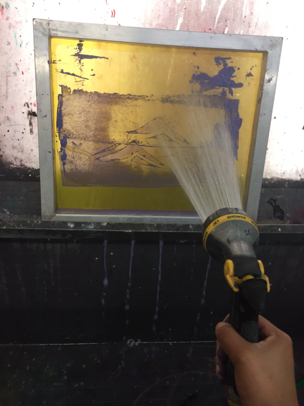
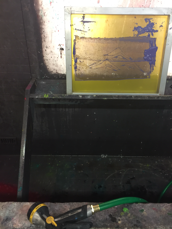
As we were finishing our process of silk screening images, we had to keep the materials in the best condition possible. Thus we were to clean them throughly. To do so we took them to a back room in which there were hoses and using the shower style I cleaned the screen of large portions of the ink. Then With a dry rag I dried the screen and finally used a blow dryer at a 10-20 inch distance to dry off the screen from any water particles.

|
|
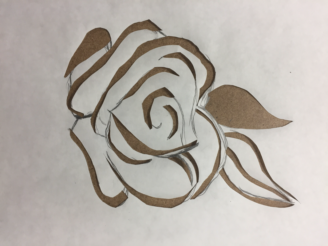
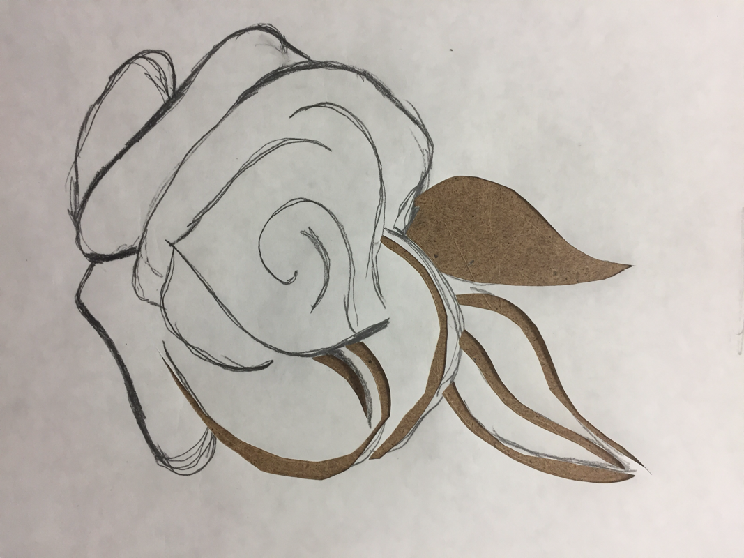
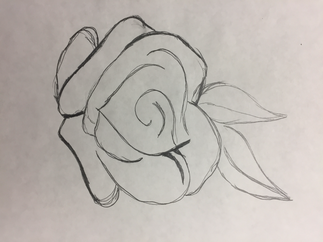
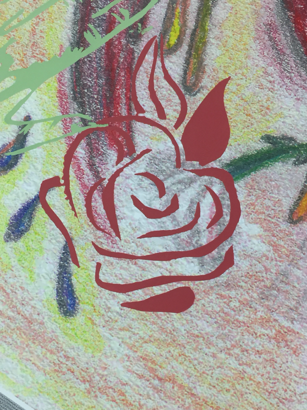
The final stencils on my pieces were not the best as I struggled at some point to efficiently transfer the images while working with with one hand since I had to hold the frame and clean off the ink by scraping it over the laid out ink. The rose and the hands were my best stencils since I had realized my mistakes after working the silk screen for the fist image of the three figures. |
C R I T I Q U E

|

|

|
|
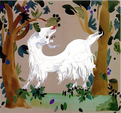
“Untitled” by Marcel Dzama (2000). Retrieved from, https://www.motherjones.com/media/2013/11/amazing-twisted-artist-marcel-dzama-sower-discord/
|
"Dance" by Henri Matisse (1869-1954). Retrieved from,
https://www.hermitagemuseum.org/wps/portal/hermitage/digital-collection/01.+Paintings/28411/?lng= |
"Untitled" by Laura Owens (2006). Retrieved from, https://www.owenslaura.com/piece/lo-314/?e=1276
|
compare & contrast
|
|
R E F L E C T I O N
Overall, I am satisfied with 50% of my work. I didn't really understand the process of silk screening after I worked with it for a couple of tries. I should have paid more attention to the details of the process. Foe example, the part where it all went downhill for me was the "simply" bend of the wrist when silk screening. Because my had was tensed up and almost at 90 degrees, my stencils looked faded on my background. I realized I had to bend my wrist more at about 45 degrees instead and then run smoothy over the ink.
Something else I wish I had done was the matter in which I organized my self during this project. I should've take notes when at MIAD. Bringing a small notepad would have been better for me as I forgot some of the terminology that the instructor gave us.
A final detail I also wish I had done was the scanning of the 2nd background while I was sketching it out. It's rather disappointing working without realizing that you miss out on the recording of your process.
ACT
R E S P O N S E S
Clearly explain how you are able to identify the cause effect relationship between your inspiration and its effect on your artwork?
As my inspirations made use harmony and human connections in their pieces I also attempted to portrayed the harmony found with in the human and the community that they build. The colors and shapes are all seen my work while in a modified version of what I saw best fit for the assignment.
What is the overall approach the author has regarding the topic of your inspiration?
The point of view of Dzama like Matisse and Owens all share a simplicity to their work. They saw/see the world in still lives while keeping simplified forms of the figures around them and capturing them in their work in a "soothing calming influence on the mind".
What kind of generalizations and conclusions have you discovered about people, ideas, culture, etc. while you researched your inspiration?
I've the conclusion that artists like those that inspired my "Nuestra Epifania" find the beauty to life through the simple shapes of the human body and the identification of expressions and emotions can be done through vibrant colors. Sometimes there is no need to keep "unnecessary info" in a piece by adding more lines and detail to a face but by keeping the right elements and adding the right feeling to it...the piece will be just as beautiful.
What is the central idea or theme around your inspirational research?
Community and structures of my hometown. Finding the history and meaning between the different components that define MKE as the one and only Milwaukee.
What kind of inferences did you make while reading your research?
I assumed that each artist had a connection to the human symphony and the community. If they did or not, I am not so sure about as each artist would have had different ideals and pass times. However I assumed such thing because I saw similarities in their works and I wished to use them in my artworks, thus it made it easier for me to think that way.
