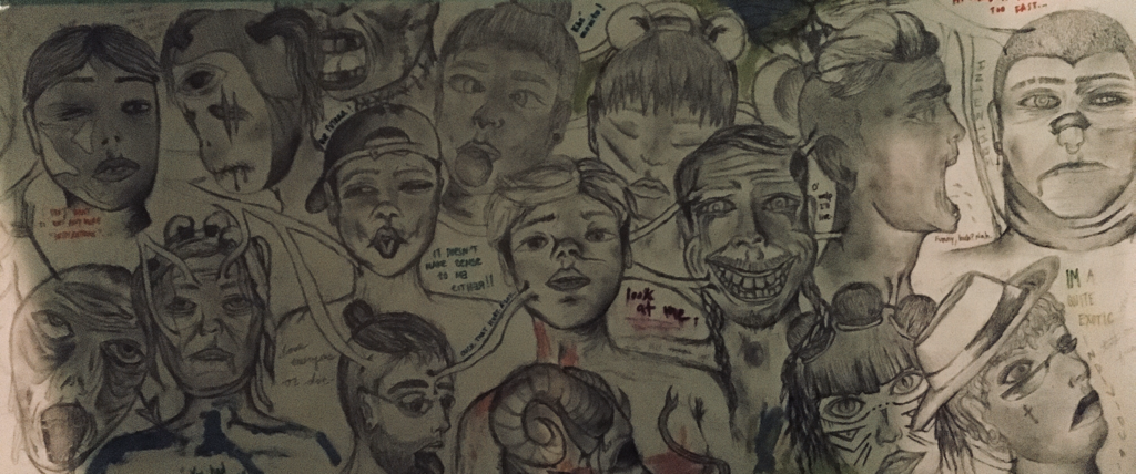
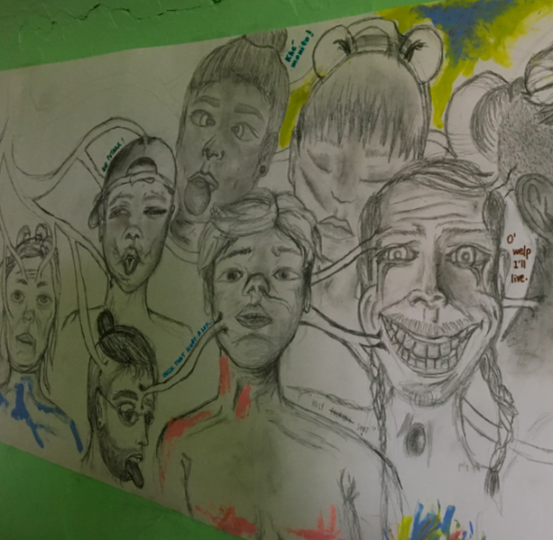
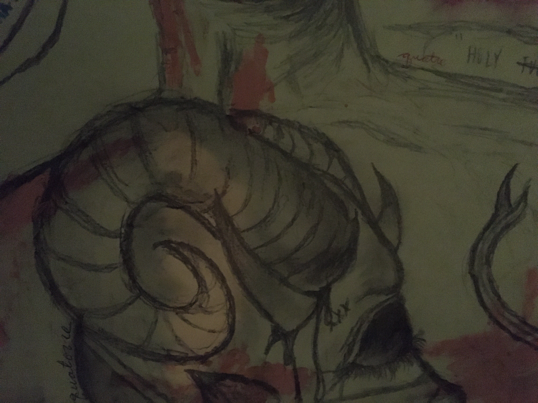
"PROJECT P"Size: 47 inches by 16 inches
Medium: Graphite on Paper (Illustration) Date: October, 2019 |
EXHIBITION TEXT
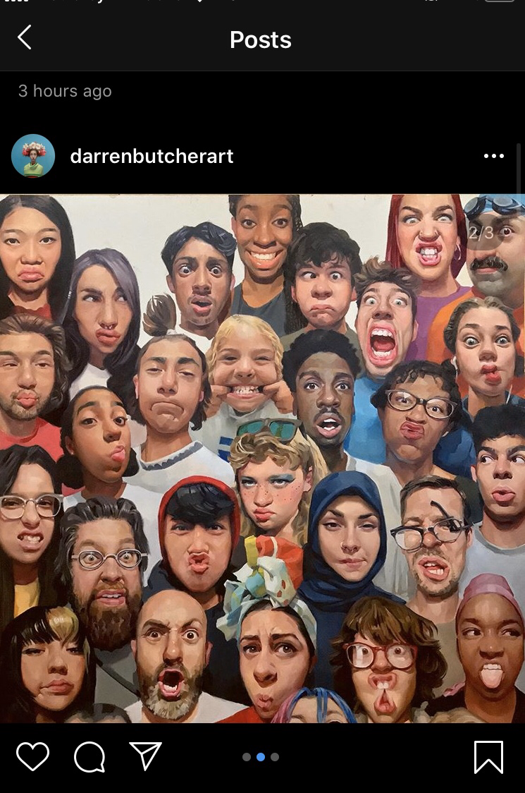
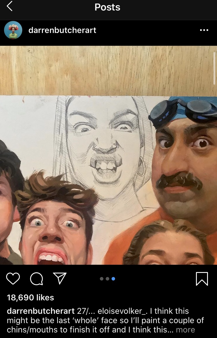
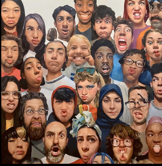
This piece has been inspired by the images found in Denis Gifford's book of "A Pictorial History of Horror Movies" as well as Darren Butcher's exaggerated illustrations that take the diversity of faces as the main inspiration for his work. Like them, I utilize the human face as my focus for artistic creation but with a twist of my own in which I add small blocks of text and color within the piece itself.
|
ARTISTIC
I N S P I R A T I O N
( A Critical Investigation )
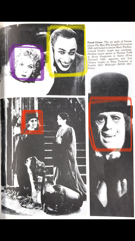
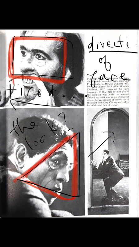
For this project I wanted to go back to books and paper references. The internet was getting a little old thus I went back to the mini library available to us in our Art Studio. The book I fell upon was one on the History of Old Horror Movies by Denis Gifford.
As I was skimming through it I caught some lines within the blocks of text that popped out at me:
As I was skimming through it I caught some lines within the blocks of text that popped out at me:
"Magic, Myth, Madness, Metamorphosis".
" We get the real dissolving view as the drug begins to manifest it's influence...the crude facial manipulations (employed on the stage)."
"Protruding teeth, high swollen cheekbones, twisted nose".
"Eccentric".
"Characters based off Edgar Allen Poe's stories"
" We get the real dissolving view as the drug begins to manifest it's influence...the crude facial manipulations (employed on the stage)."
"Protruding teeth, high swollen cheekbones, twisted nose".
"Eccentric".
"Characters based off Edgar Allen Poe's stories"
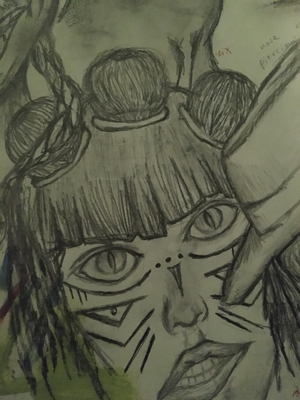
Because the book revolved so much around the pictorial representation of extravagant looking characters...I thought I could incorporate such idea within my third project. The dark gradations and values of black and white pictures were rather interesting to me thus I thought about making a larger piece in which I can showcase a similar gradation of such gray scale.
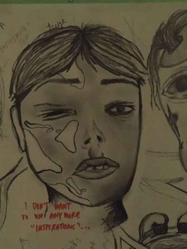
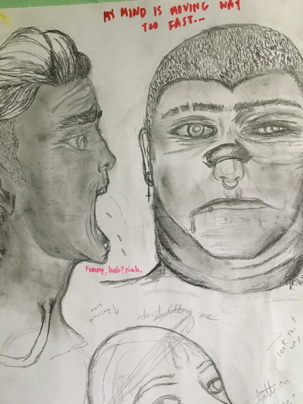
The faces within my "poster" would become fragments of not only the faces I saw within the book but my own persona.
A handful of the faces and "muecas" in the piece are based off my own expressions and hybrids of the scans I saved from the book.
I also thought about the "metamorphosis" that the actors would go through when transforming onto these deformed yet eccentric looking facial structures.
Something else that inspired this project were the faces I saw on a every day basis. When I went to the art museum on Thursday or at the coffee shop and even at the laundromat...they were everywhere. Whatever it was that I saw on an individual I saw it an exaggerated version of my "creative skills" and took note of it in my phone to add to my poster later that day. Not single human will be built the exact same way, excluding twins not that I think about it, but the point is that this was a moment where as cliche as it may sound "art imitates life". I only decided to continue on with this project because the images in the book made me realize that there's no limit to our imagination. We can people look as goofy or intimidation as we want based on our portrayal of their physical qualities. It's not the best thing to do because there has to be universal acceptance yet in this case, for the artistic choice, that's the plan and purpose of the piece. I wanted my inspiration to resonate in my piece with the "crude facial manipulation" presented in my own piece with a style I have complete control over.
As far as Darren's art, I like the saturation of individuals/faces that they incorporate to their pieces. I don't plan on using any color on my piece yet the overlapping of the individuals and different racial/cultural backgrounds that are found in his piece are rather appealing to me, thus I want to also saturate my paper with as many faces as I possibly can.
I also want to incorporate the diversity that Darren carries in his own pieces since it makes my poster/paper more dynamic and interesting to look at. I'm hoping I can also improve on my craftsmanship with graphite as I move along with the project.
I want "PROJECT P" to be it's own thing, I want it to hold its own soul and speak for itself...
Hopefully by bringing historic film pieces with a rising contemporary artist in this self-made "collaboration" between the two styles, I will
|
|
P R O C E S S
&
I N T E N T I O N S
01. Creative Ideas & Brainstorms
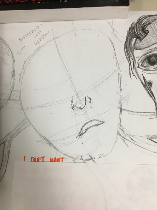
Like I mentioned in the Critical Investigation, I based off the sketches on the faces I saw with a book on the "Pictorial History of Horror Movies". Some of the most famous characters were avoided because I didn't want to simply copy and paste such "legends" per say. I wanted to create my own. Thus I decided to freestyle every single one of the faces.
As a result I don't have traditional sketchbook pages with my planning sketches since I did dive right into the piece and got to work right on the paper itself.
However for the creative ideas of what the faces themselves would be...
I took some notes throughout the time period that I was working on "PROJECT P". Some were digital and others are on my sketchbook from when I had the book next to me to annotate the informational text as well as any interesting facial features that would jump out at me:
|
|
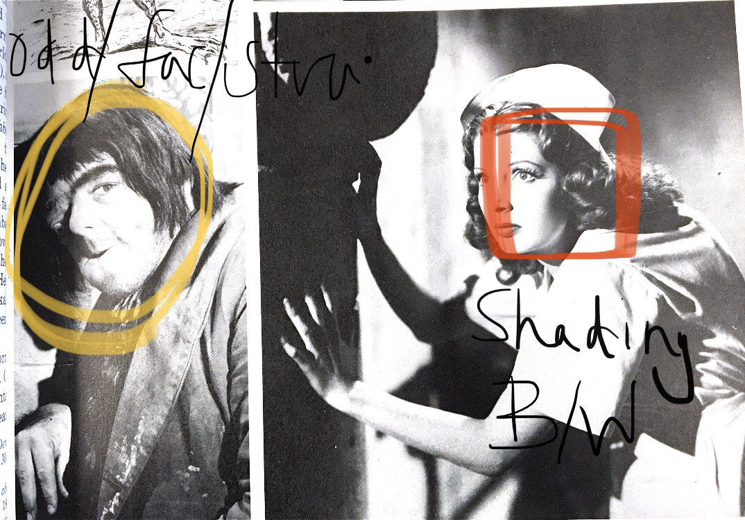
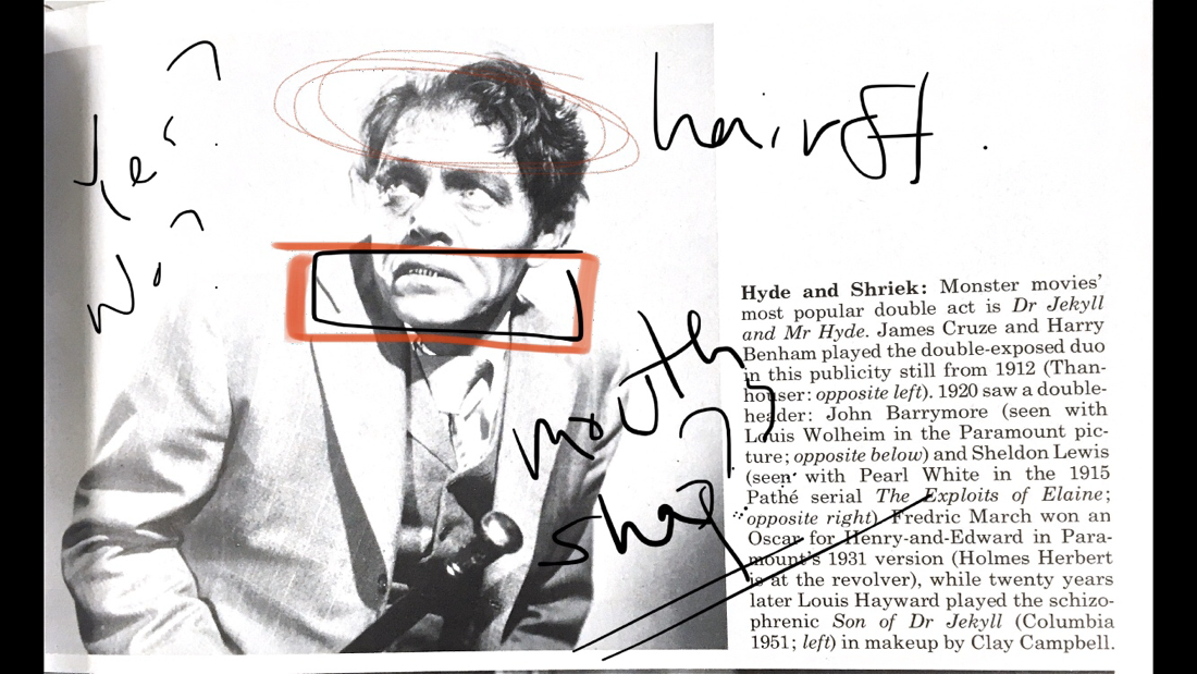
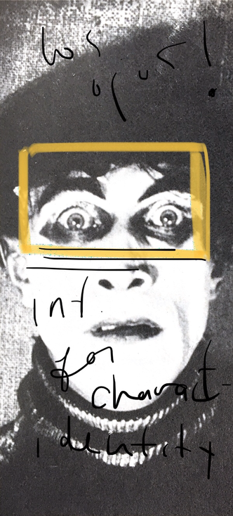
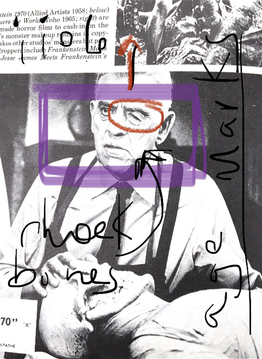
After scanning some of the faces in the book I decided to take some digital notes on the scanned pages.
Those are displayed above with highlighted portions and specific notes on the details that I found to be helpful.
Some other of these pages are used for reference on just the facial expressions and shadows.
Those are displayed above with highlighted portions and specific notes on the details that I found to be helpful.
Some other of these pages are used for reference on just the facial expressions and shadows.
02. Into Planning
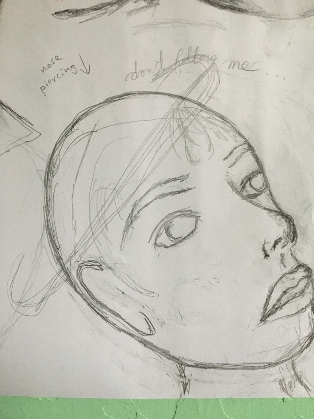
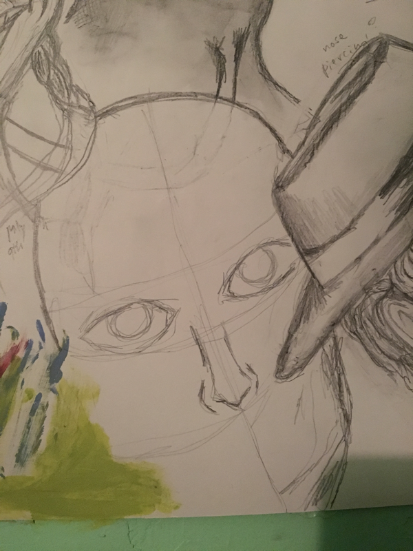
Because the faces have been free-styled for the entirety of the piece I had little to no planning to do. I simply placed an outline of how many faces I could have possibly fit within the single sheet of paper and went from there.
As for the faces, once I had the base of the face and an idea of the position it was going to be in, I began adding details to their persona.
As for the faces, once I had the base of the face and an idea of the position it was going to be in, I began adding details to their persona.
Furthermore, as I was working on the faces I was too caught up in the creation process that I didn't have any real or original layout for my illustration and I forgot to take pictures of every individual face that you'll find in the poster. However I captured one or two of these faces and the process was more or less the same for each of them.
|
|
|
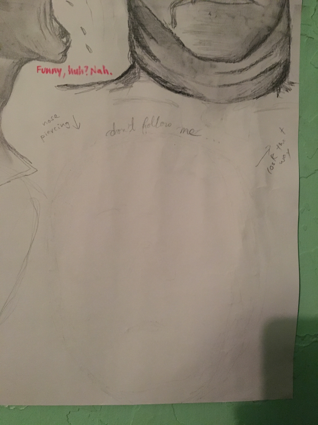
03. It felt too plain...
As I was finishing up the faces, I felt like the faces were too dark or heavy with tones of gray.
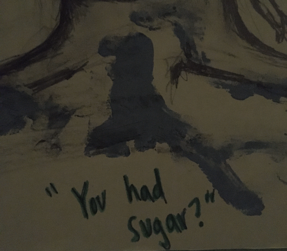
I could've left it as they were, however I felt as if I needed to add some sort of color to the poster. I began gravitating to my paint tubes. I didn't use any paintbrushes and simply created some raw and aggressive swatches of paint by using my fingers to go over the shoulders or heads of some of the figures.
Once the paint had dried up I went back with pencil and drew over it to create an overlapping effect between the paint and the illustrations.
Some of the applications of the paint could've done with more patience but I was experimenting with it all thus I didn't think it took away anything from the composition.
Take for example the section of the poster above.
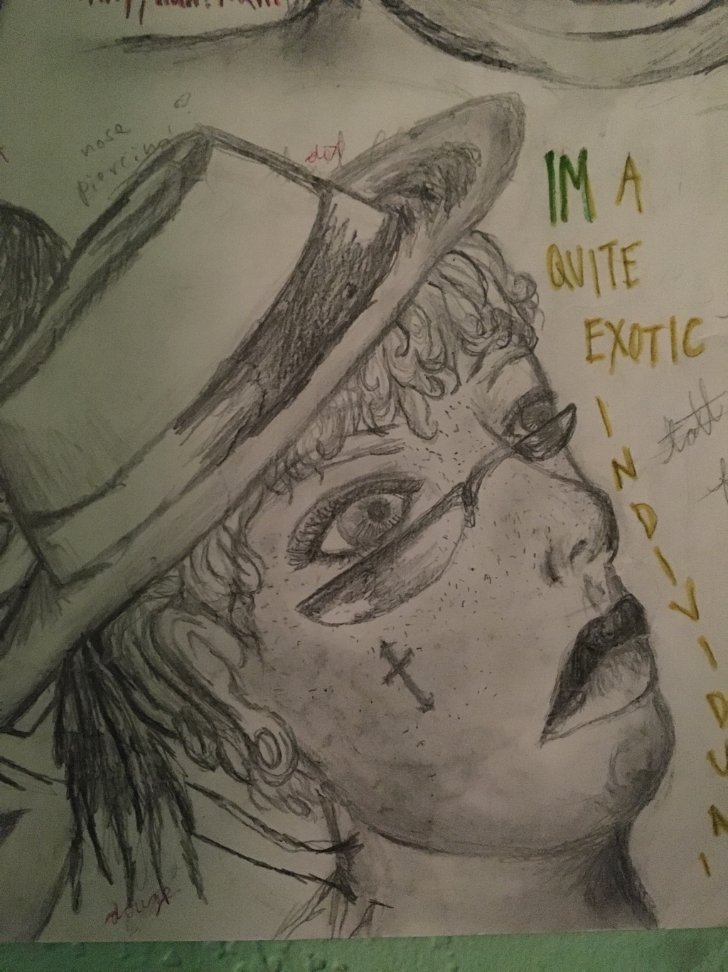
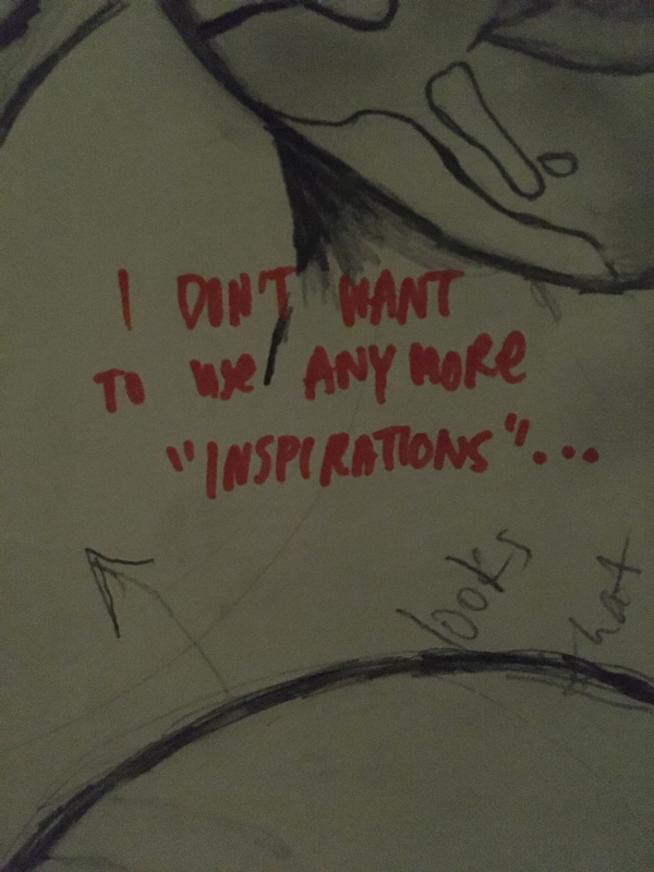
04. More Color & Addition of Text.
As I was completing my piece I realized that the amount of detail in the faces couldn't cover the spaces in between the faces.
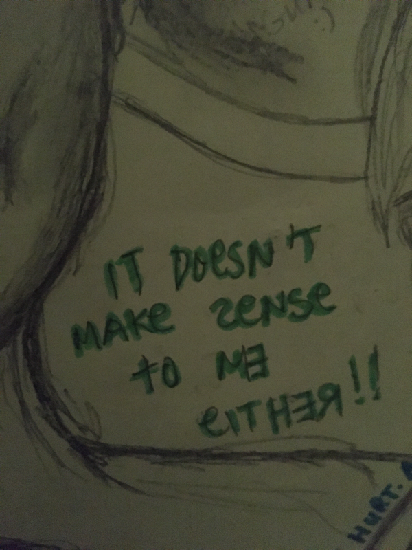
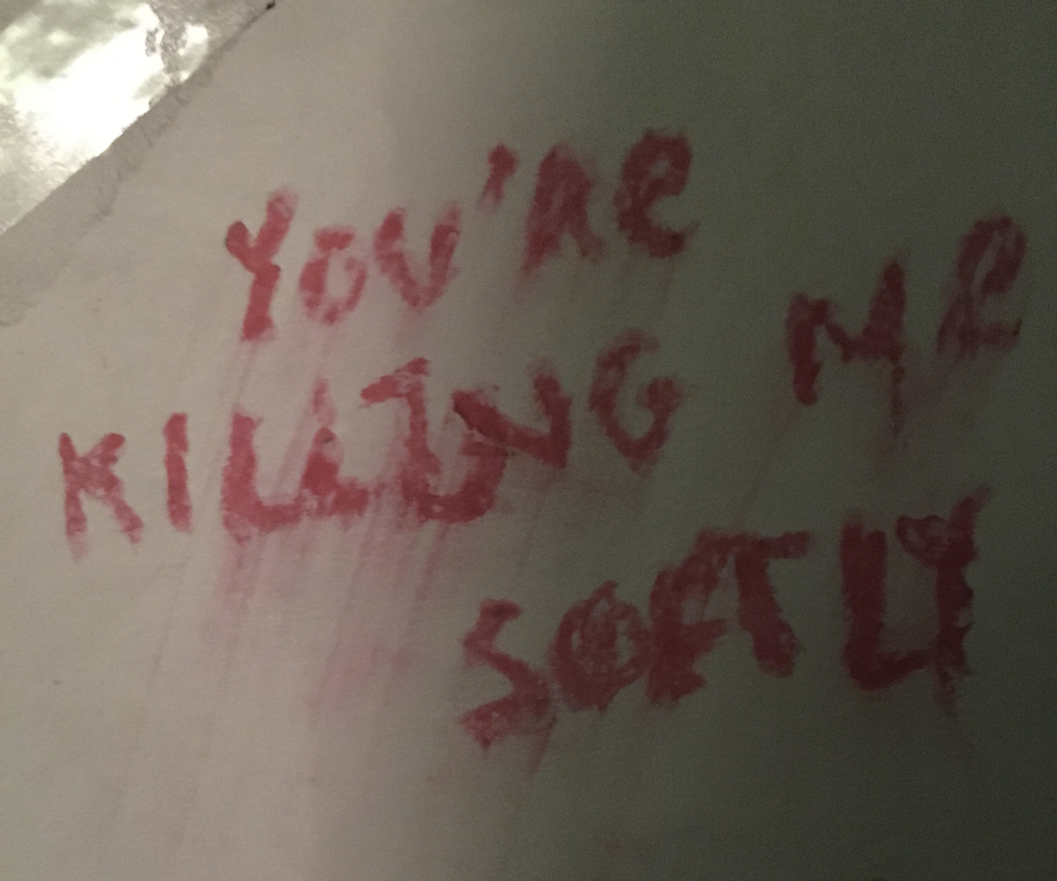
I began to write down my thoughts as I worked through the compostions of faces. I wanted to add more hues to the piece and so the pieces of text were written in different fonts with different mediums in different languages.
This became a way in which I was able to incorporate part of myself into the artwork itself.
C R I T I Q U E
COMPARISON POINTS:
- usage of faces as main concept of the artwork
- same usage of black and white gradations when it comes to the pages in the history book of horror films and my illustration.
- non or semi realistic imagery of the human face, improvisation of human features that don't look quite human
|
CONTRASTING POINTS:
- When it comes to Darren's work an mine, it's rather clear that he uses color in his work to help me add detail to the faces, ethnicity, age, more specificity to the different characters on his canvas. Me on the other hand depend on the shading that I'm able to create with a pencil to add age marks and other details that gives an essence of the characters I decided to create. These would come in in the form of the eyes, head shape and certain artifacts on their faces.
- The material use is very different. One of my inspirations are images taken from old films while the other are pencil sketches detailed with paint. I only used graphite and my fingers to blend.
- My characters flow a little less, I'm restricted to my basic knowledge of human facial structure and and first piece that I attempt to illustrate as a whole. Darren and the images in the book come from professionals that dedicate their life to this type of art thus yielding a different material when it comes to craftsmanship.
R E F L E C T I O N
I think this is one of my favorite pieces so far. It consumed a lot of my time to complete it yet the way that the "personas" align and saturate the paper gave me a sense of accomplishment. I could've placed the paint on the figures in a more "accurate" manner yet I feel that the spontaneous feeling that is portrayed from the current paint strokes matches the rest of the composition. I never really practiced drawing the human face in detail so the figures presented in "PROJECT P" look somewhat odd to the eye. Therefore I would say that I could've studied more the human form so the faces would appear less stiff and with more natural poses.
The balance that can seen in the poster could have also been better planned.
However considering that the work was being planned at the same rate it was being created, it turned out to be as equivalent on every portion of the paper as it could've since the negative space available was not big enough to continue the addition of a cohesive positive space.
Perhaps the color seems somewhat out of place but like I said, it's an artist choice that I took because that's what I felt that the piece needed to be complete. It adds to the significance and a textual method to showcase metaphors within my piece as a goal of mine for most of my pieces.
ACT
R E S P O N S E S
Clearly explain how you are able to identify the cause effect relationship between your inspiration and its effect on your artwork?
The black and white images of the faces in the history book of films transferred to my poster as the contortions and imagery of non human faces inspired characters of my own imagination for my final illustration.
What is the overall approach the author has regarding the topic of your inspiration?
Most of the text refers to the films are portrayals of the mythical, eccentric and metamorphosis of actors into these fictional characters that later on became iconic figures of the horror genre.
What kind of generalizations and conclusions have you discovered about people, ideas, culture, etc. while you researched your inspiration?
I realized that I gravitate towards similar subjects: the eccentricity of the human form in its raw and crude nature. It wasn't until I was answering this ACT questions that I saw a some hint of Francis Bacon's portraits within the distortion and uniqueness of the faces in the pictures.
What is the central idea or theme around your inspirational research?
The intersectionality in which the human form can come in as well as the contorsion of the human facial expression.
What kind of inferences did you make while reading your research?
I thought that the artist based off their ideas on an original sketch of the costume but as they worked on it, it became the creator's artistic choice that finished the final product.
